If you’re ready to jump into hand lettering with watercolours but you’re feeling overwhelmed with your options, don’t worry! This tutorial is for you!
In this week’s lesson, we’re diving into four popular watercolour choices for watercolour hand lettering. I’ll break down how each one looks and performs. Then we’ll decide which brand is the winner! Are you ready? Let’s go!
First Things First…
The links below may be affiliate links where appropriate. This means that your purchase through these links may result in a few cents in payment to me, to support creating further resources like this one! That being said, I will never suggest supplies that I do not personally use and fully recommend.
Tools
- Ecoline Liquid Watercolours
- Artists Loft Liquid Watercolours
- Dr. PH Martin’s Hydrus
- Winsor & Newton Cotman
- Strathmore Cold Press Watercolour Paper
- Princeton Snap Round Brush
- A Glass of Water
Now let’s get started!
Prefer watching over reading? Feel free to skip right to the video and see these in real-time! ??
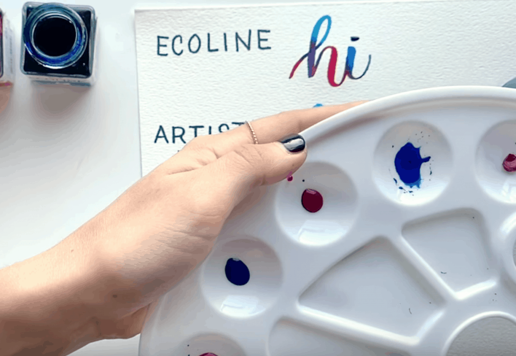
Step 1: Getting your colours ready
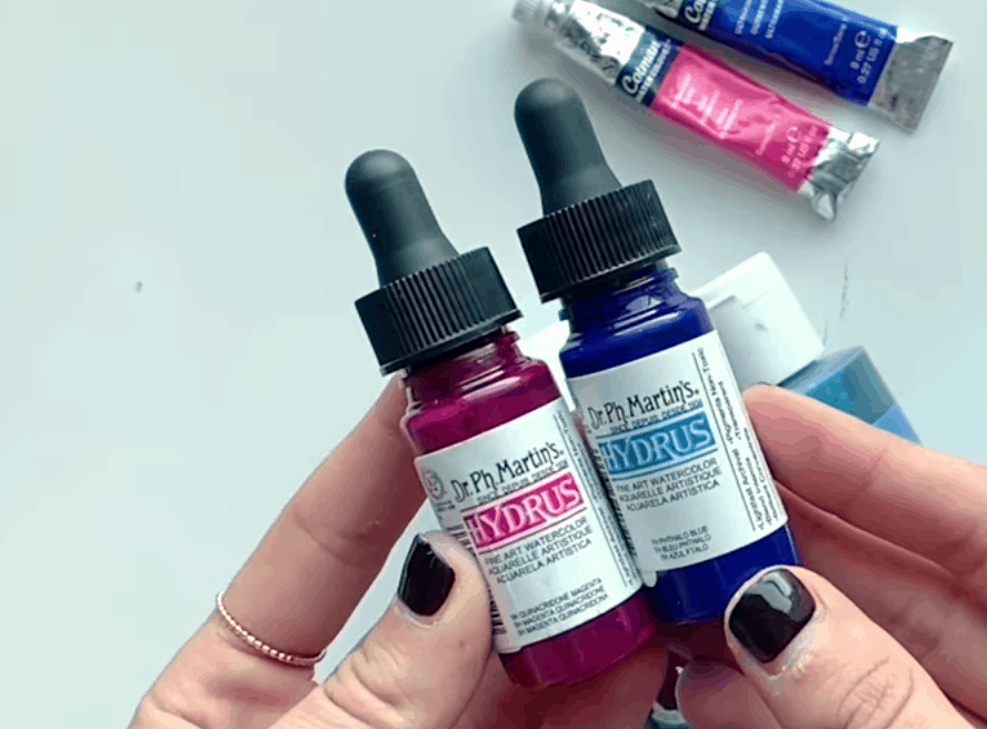
Dr. PH Martin’s Hydrus – these are high quality (=expensive!) 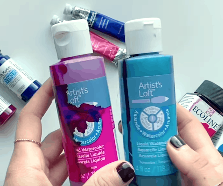
Artists Loft Liquid Watercolours – cheaper alternative to ? 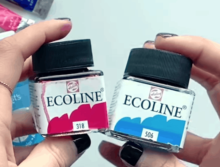
Ecoline Liquid Watercolours – on the pricier side but I ❤️them 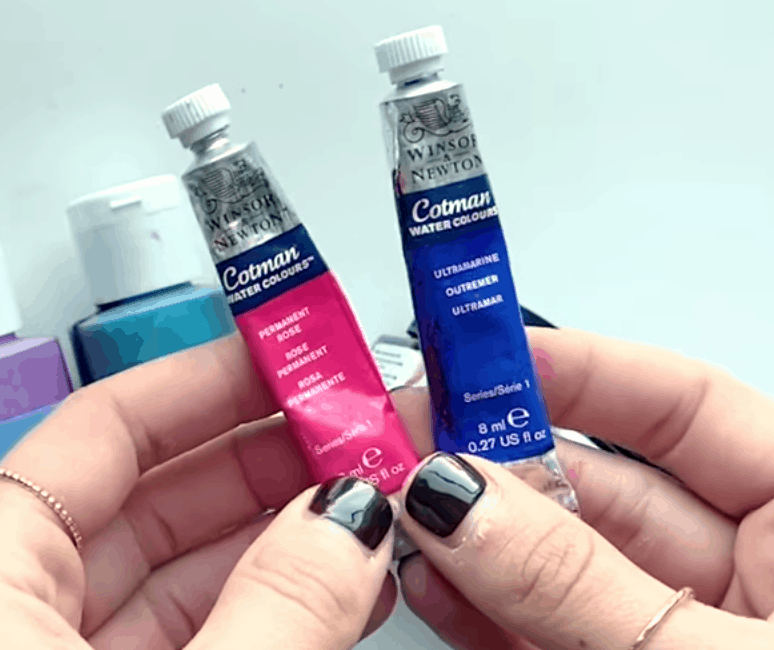
These are tubes that you add water to. 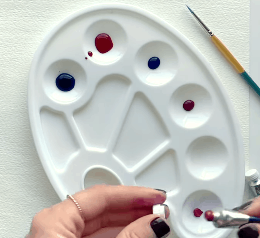
All but the Ecoline get put in the palette?
Pro Tip: If you let your colours dry, you can always come back to them to rewet and reuse!
Step 2: Testing your colours
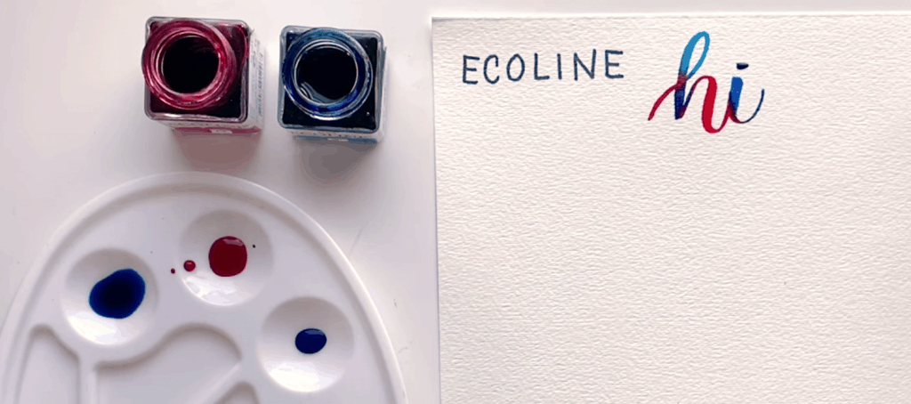
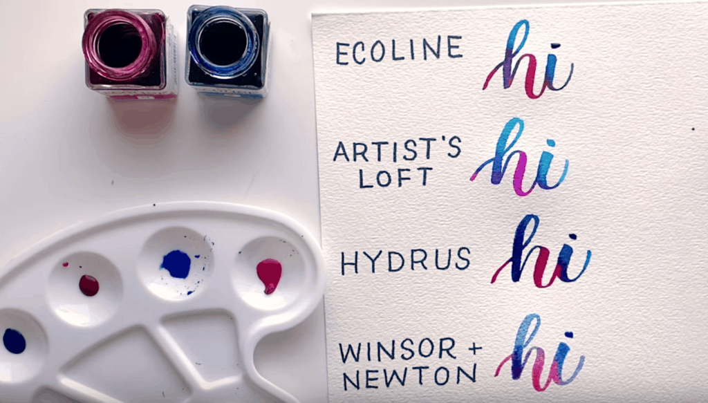
Ecoline
Switching colours with every stroke, be sure to keep the clours very saturated to give them a nice blend.
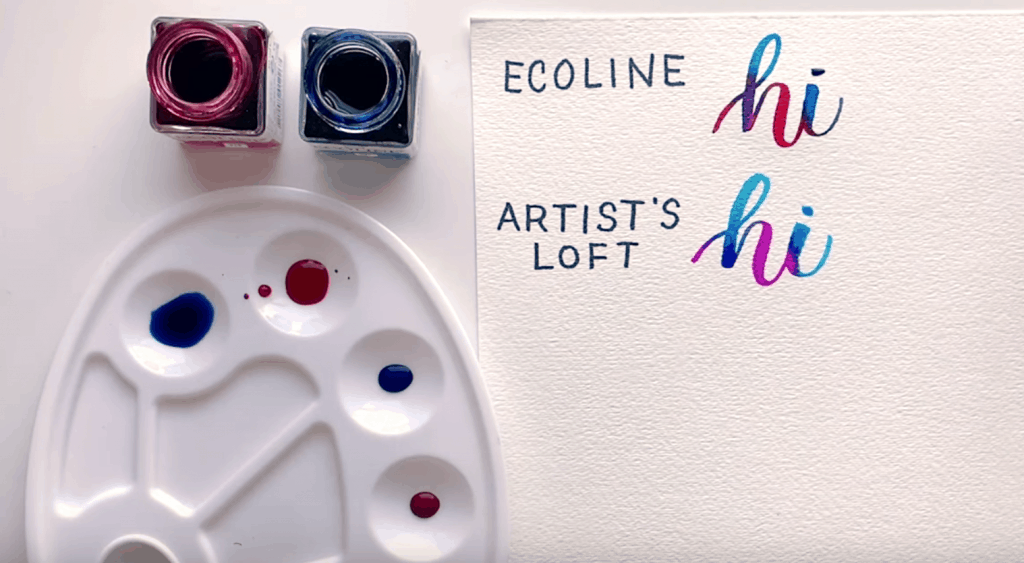
Artist’s Loft
Here, I’ll demonstrate the same blending pattern so that we can compare ? to ?
You’ll notice right away that this brand doesn’t do as much of a bleed as the Ecoline.
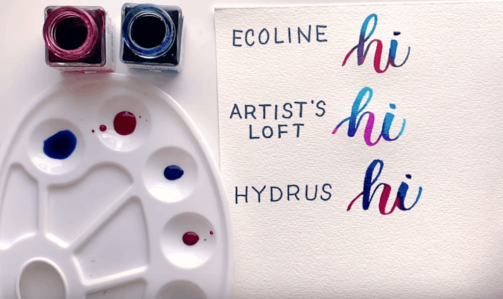
Hydrus
You can see here right off the ?that these colours are much more pigmented. They are darker and more saturated, so you’ll want to add a liiittttle more water here.
Winsor & Newton
You’ll want to use your brush (or a dropper works, too) and add A LOT of water to these.
You can see right away which ones are darker or lighter or more vibrant. My favorite is still the Ecoline because of its vibrancy and it blends really well.
The Hydrus has some vibrancy too but it’s just a bit darker and harder to see the blend whereas the Artist’s Loft is a great option to save some money and still get that blended look. With the Windsor & Newton, it has more of that transparency and can require additional layers of colour.
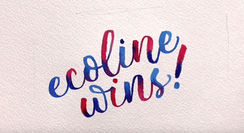
And that’s a wrap!
Ready for more watercolour practice? Check out How to do watercolour blending where I go into detail about blending or check out my watercolour workbooks right here.

Comments