

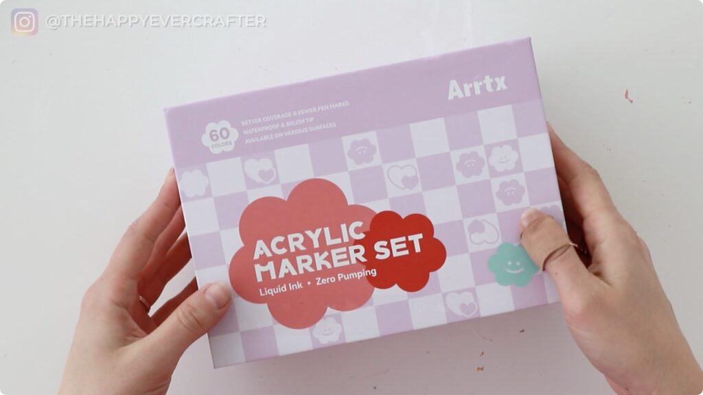
I’ve had these markers sitting on my desk for weeks now, just waiting for the right moment to try them. Today, I decided there’s no better time than right now – no grand plan, just pure experimentation. Arrtx sent me a set of their acrylic markers, and I’m finally cracking them open.
Supplies Used
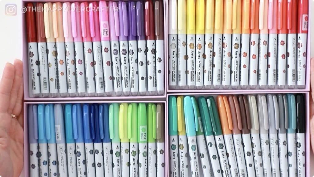
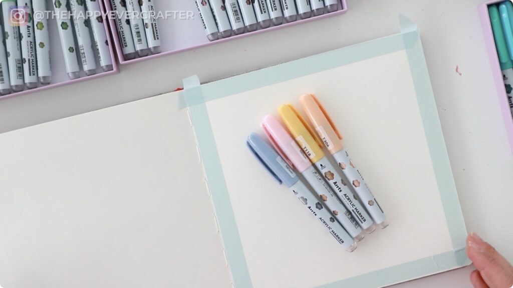
- Arrtx Acrylic Markers (60-colour set)
- Watercolour paper journal
- Washi tape (for clean edges)
- Black pen for detailing (optional)
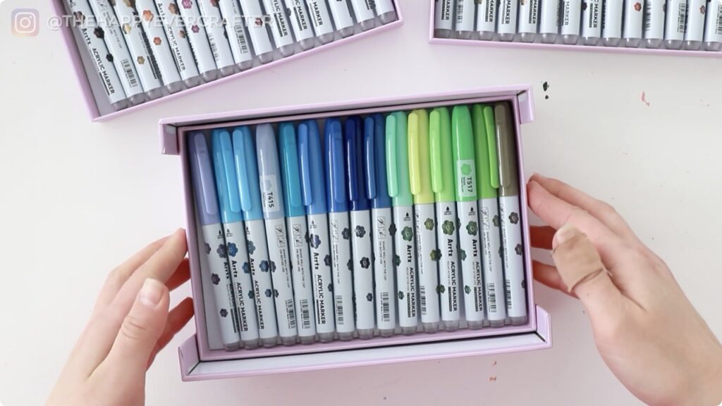
The markers themselves come in a really smart box design with removable trays, which makes it easy to spread everything out and see your full colour range. It’s a small detail, but I appreciate thoughtful packaging.
Rather watch than read? Check out the full video by clicking the video below!
Let’s Get Started!
This is one of those art experiments where I’m not entirely sure what I’m making, but I’m excited to see how these markers perform. Let’s dive in.
First Impressions
Right out of the box, these markers look promising. The brush tips are significantly large and already saturated, which means no priming or pumping needed – the “zero pumping” claim on the box seems accurate. The colour variety is impressive, with 60 shades ranging from soft pastels to bold, saturated tones.
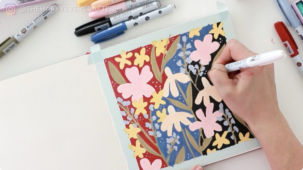
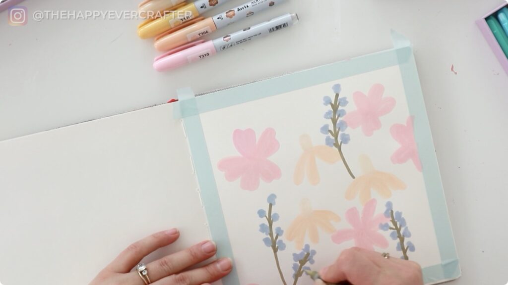
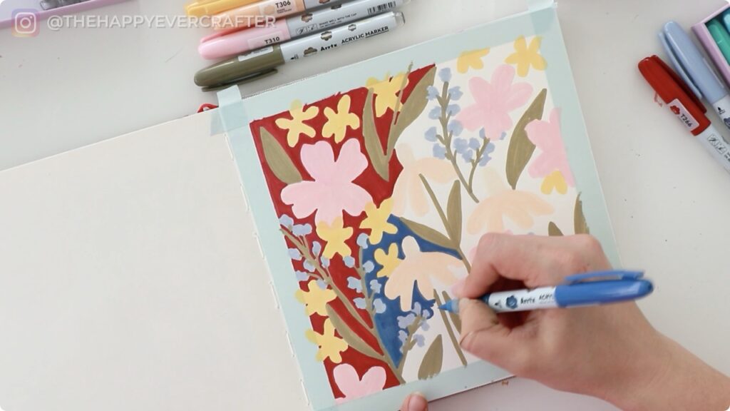
I decided to create a pastel floral spread in my journal. Maybe it’s just Easter being on my mind, but I gravitated toward light pinks, peachy tones, soft blues, and a gentle beige. I taped down the edges of my page with washi tape – something I always do when creating doodle spreads because it gives such a satisfying crisp border at the end.
Testing the Markers
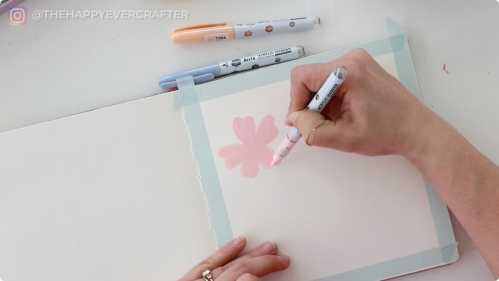
As I started drawing simple flowers – nothing fancy, just scribbles really – I noticed a few things right away.
The coverage is solid. The first stroke of that bold pink was incredibly pigmented. But here’s something worth noting: the second and third petals I drew were noticeably lighter. These markers need frequent shaking to keep the colour consistent. Once I gave them a proper shake (you’ll hear a little ball rattling inside), the coverage improved significantly.
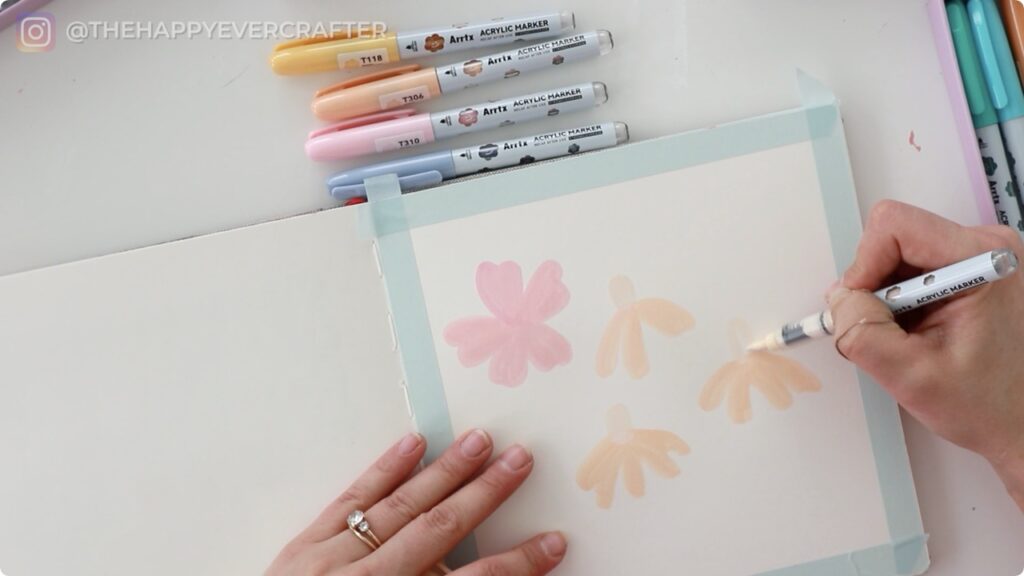
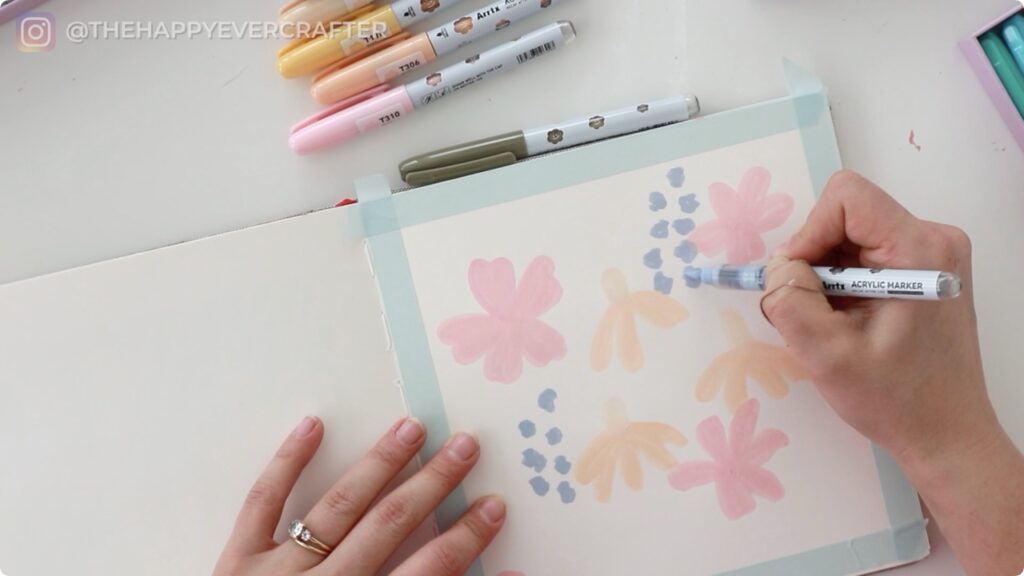
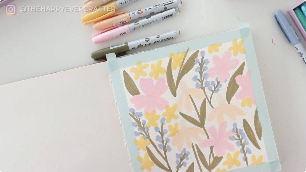
They layer beautifully. Unlike water-based markers, these acrylics are opaque enough to layer colour on top of colour without the underneath shade showing through. This is exactly how acrylic paint behaves, which makes sense. When I tested putting pink over peach, the pink sat cleanly on top – a huge plus for building up compositions.
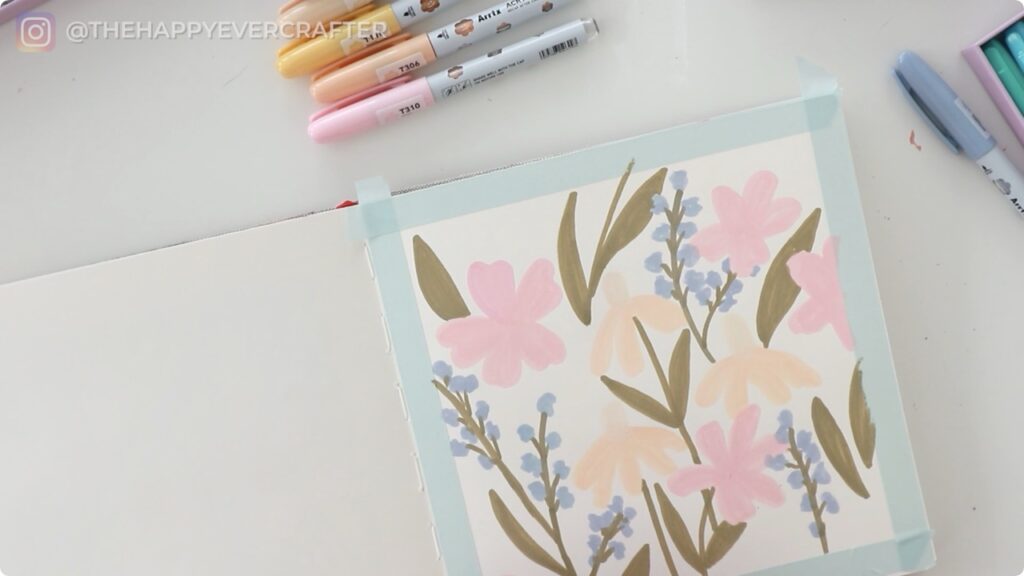
The brush tip is flexible. You can get thin lines and thick strokes depending on your pressure, which I love as someone who practices brush calligraphy. That said, the tip doesn’t have much “bounce back.” When I pressed down, it tended to stick at an angle rather than spring back to its original shape. For actual calligraphy and brush lettering, this would frustrate me. But for colouring and doodling, the flexibility is perfect.
The paper matters. I was working on watercolour paper, which is quite absorbent. It felt a bit like using a paintbrush that needs constant re-dipping. Smoother paper would probably give even better results and require less shaking between strokes.
Taking it Further
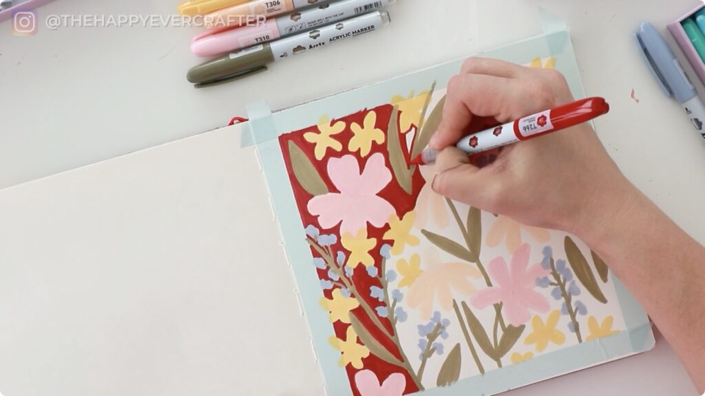
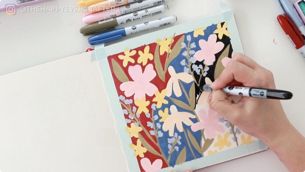
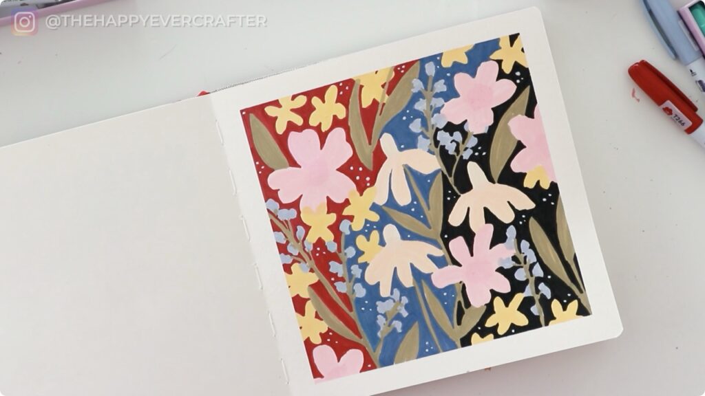
Halfway through my floral doodles, I had what might have been a questionable idea – what if I filled in the entire white background with bold colours? I decided to section off the background and try different shades: a deep maroon-red, a rich blue, and eventually black.
This is where things got interesting. The coverage held up beautifully even when filling large areas. The markers didn’t streak or fade, though I did notice the brush tip starting to fray slightly on the edges from the rough watercolour paper. That’s on me for jumping straight into textured paper without testing on something smoother first.
The White Marker Test
Here’s the real discovery that made this whole experiment worth it: the white marker is genuinely opaque.
Finding a good white marker that actually shows up over dark colours is notoriously difficult. I even have a whole video dedicated to testing white pens because so few of them deliver. But this one? It worked over the maroon background, the blue background, and even over solid black. I added little white dots throughout the composition as embellishments, and they popped beautifully.
If you’ve been searching for a reliable white acrylic marker, this might be the one.
That’s a Wrap – Final Thoughts!
These markers are fun, versatile, and surprisingly easy to use. The colour selection is excellent, the packaging is practical, and that white marker alone is worth celebrating. I wouldn’t recommend them for serious brush lettering or calligraphy work – the tips just don’t have the springiness I’d want for that. But for colouring, layering, and creating bold illustrations, they’re a solid choice.
As for my floral experiment? It’s not something I’ll frame and hang in my home, but it served its purpose perfectly. I tested colours, played with layering, and got some creativity out of my system without overthinking it. When I peeled off that washi tape at the end and saw those crisp edges, I felt that little spark of satisfaction that makes art projects worthwhile.
If you try a composition like this, my advice is simple: don’t overthink it. Grab some colours that make you happy, draw little doodly florals, and see where it takes you. They don’t need to be realistic or perfect – just let yourself experiment. What’s your favourite way to test out new art supplies?
If you’re looking for more product reviews, check out this Ohuhu markers post!
And finally, your dad joke…
A clown held a door open for me yesterday….
I thought it was a nice jester.


Comments