
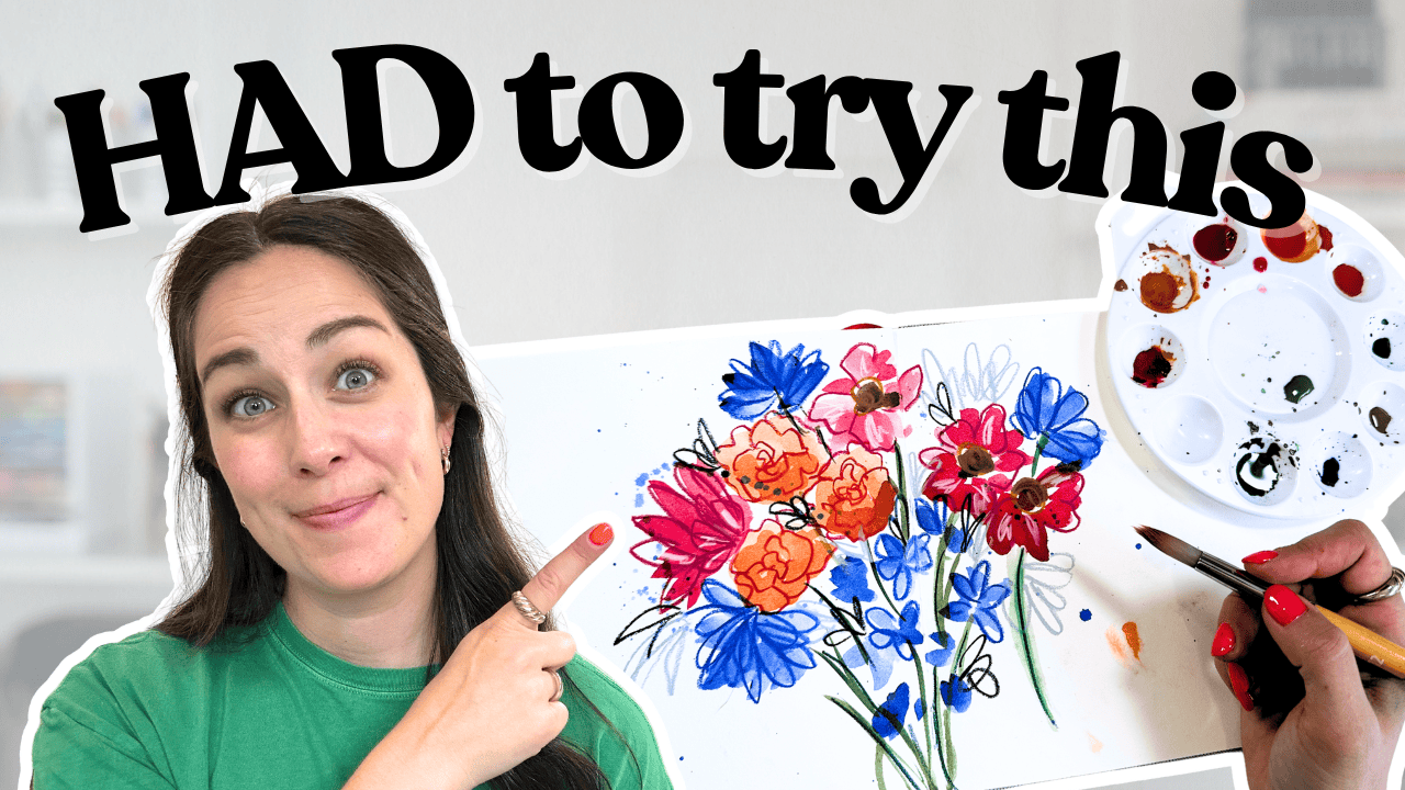
You know when you’re scrolling through Instagram and you see someone’s art that makes you think, “I need to try that right now”? That’s what happened when @tammykayeart’s watercolour florals popped up on my feed. I had the supplies. The composition looked achievable. But immediately, my brain split into two voices: the devil brain saying “You’re not good enough,” and the angel brain countering with “Just try it. If you fail, who cares?”
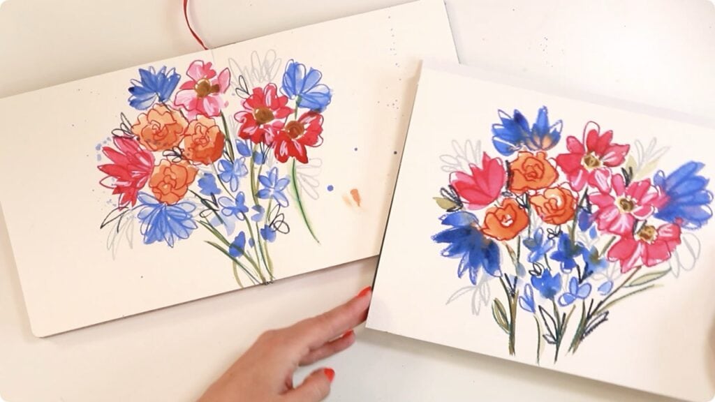
So I did. I painted Tammy’s loose floral composition twice – once following along with her video, and once from memory. Here’s what I learned about painting outside your comfort zone.
Supplies Used
- Watercolour paints (orange, pink, brown, blue)
- Two brushes (one larger for flowers, one smaller for stems)
- Water-soluble crayons or pastels
- Watercolour paper or sketchbook
- Palette and water
The beauty of this style is that it’s meant to be loose and imperfect – you can adapt the colours to whatever you’ve got on hand.
Rather watch than read? Check out the full video by clicking the video below!
Let’s Get Started!
I decided to attempt this painting twice – once by following along and once by memory. Let’s get to it!
Attempt #1: Following Along
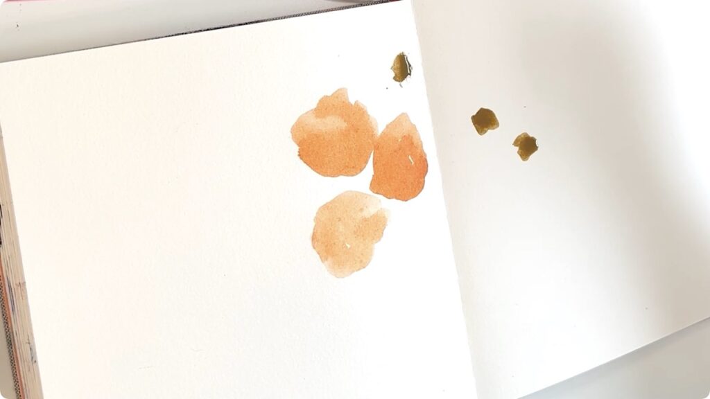
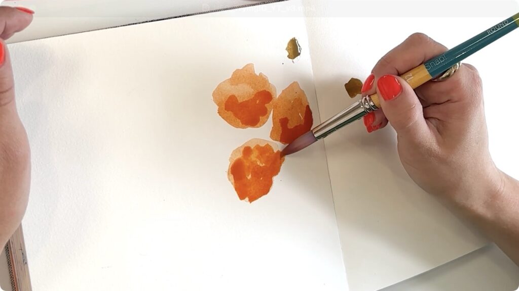
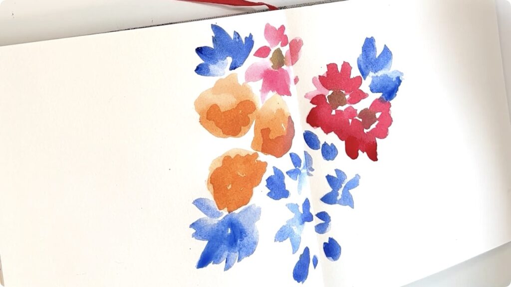
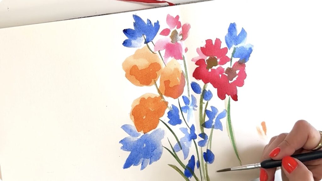
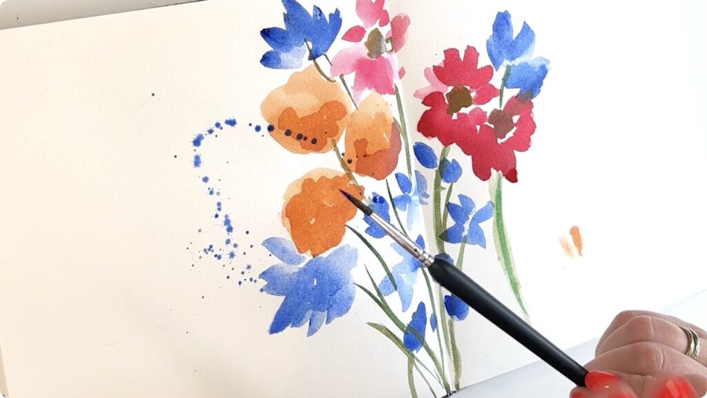
I watched Tammy’s video through once, then paused it as I painted to copy exactly what she was doing. She started with loose blobs of colour (three orange, three brown), added pink strokes, layered in blue flowers, then connected everything with stems. The whole thing felt spontaneous and confident, which was both inspiring and terrifying.
Right away, I started questioning the process. The blobs looked messy, so I added more pigment while still wet to create those bleeds I love in watercolour. The pink and blue flowers came next – nothing too precious. Then the stems, which is where I felt most intimidated. Tammy’s brush strokes were decisive and confident, whereas mine felt hesitant. I’d make a stroke, not like it, and add another one to compensate. She just went in and committed.
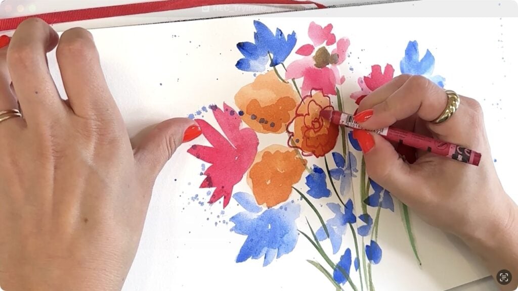
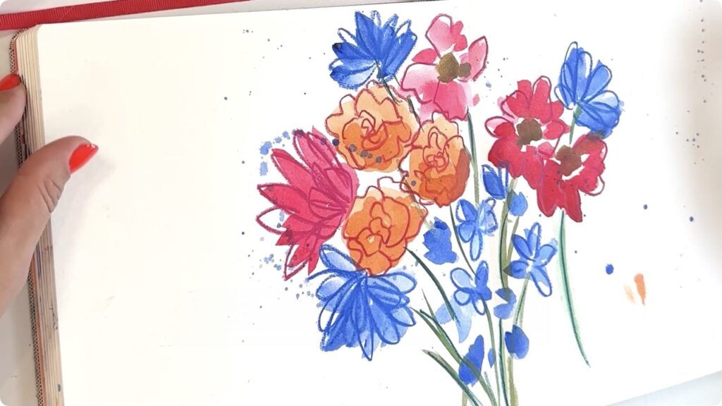
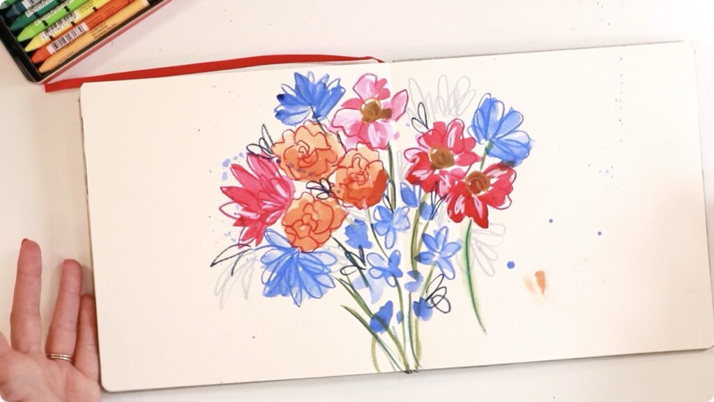
Once the paint dried, the water-soluble crayons brought everything together. Tammy layered pink over orange, blue over blue, brown centers, white highlights – essentially just doodling. This part felt much more comfortable. I could touch up areas I wasn’t thrilled with and add definition where the watercolour felt too loose. By the end, I was actually happy with how it turned out. It wasn’t perfect, but it felt playful and alive.
Attempt #2: From Memory
After the first piece, I challenged myself to do it again from memory on better watercolour paper, trying to paint more confidently. Here’s the thing – I actually preferred the first one. The second attempt felt rushed. I was trying to force myself to be loose and spontaneous, but moving faster meant more unwanted bleeding and overcompensating with extra layers. It became darker, bolder, and tighter. I was trying to fill all the space instead of letting the composition breathe.
What I Learned
Once the background stripes were dry-ish (I’m impatient, so I didn’t wait for them to be completely dry), I grabbed a tiny brush and started painting in the flowers. I kept it simple – little stems, leaves, and blooms in yellow, pink, and green. I wasn’t overthinking it, just copying the general vibe from the wallpaper pattern.
Figuring out how much water to use with the gouache was tricky. Too much and it would be runny, too little and it wouldn’t flow smoothly. I probably didn’t use quite enough water, but it worked out. The darker shades ended up looking really lovely against the lighter background.
That’s a Wrap!
The biggest takeaway: going slower actually helped me paint looser. When I followed Tammy’s tutorial step by step, I was watching and observing, then making intentional marks. When I tried to paint “spontaneously” from memory, I overthought it and second-guessed every stroke, adding too many layers and losing that effortless quality.
I also realized this style isn’t naturally comfortable for me yet, and that’s okay. Learning from a tutorial gave me permission to experiment without the pressure of it being entirely my own vision. Both pieces turned out pretty, and the process taught me something valuable about confidence, pacing, and letting go of perfection.
If you’ve been seeing art on Instagram that makes you want to try something new, just go for it. Even if it doesn’t turn out exactly like the original, you’ll learn something. What’s your favourite way to step outside your creative comfort zone?
Looking for more inspiration? Check out this one!
And finally, your dad joke…
What do you call a duck that gets all A’s?
A wise quacker.


Comments