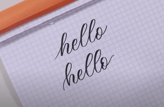
I’m going to show you three easy tricks that will really add some flair and personality to your calligraphy.
So, you’ve gotten the hang of a pretty basic calligraphy alphabet, and you’re ready to start putting your own STYLE on it. Awesome! Let me show you 3 SUPER quick tricks you can take right away and apply to your letters to make them look more unique and stylized!
I do also want to mention that I have an entire workbook dedicated to learning how to “bounce & stylize” your alphabet – you can check it out, here.
First Things First…
The links below may be affiliate links where appropriate. This means that your purchase through these links may result in a few cents in payment to me, to support creating further resources like this one! That being said, I will never suggest supplies that I do not personally use and fully recommend.
Tools Mentioned
Prefer watching over reading? Feel free to skip right to the video and see these in real-time! ??
Trick #1: Exaggerate your loops (descenders and ascenders)
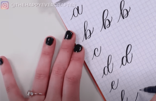
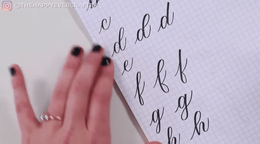
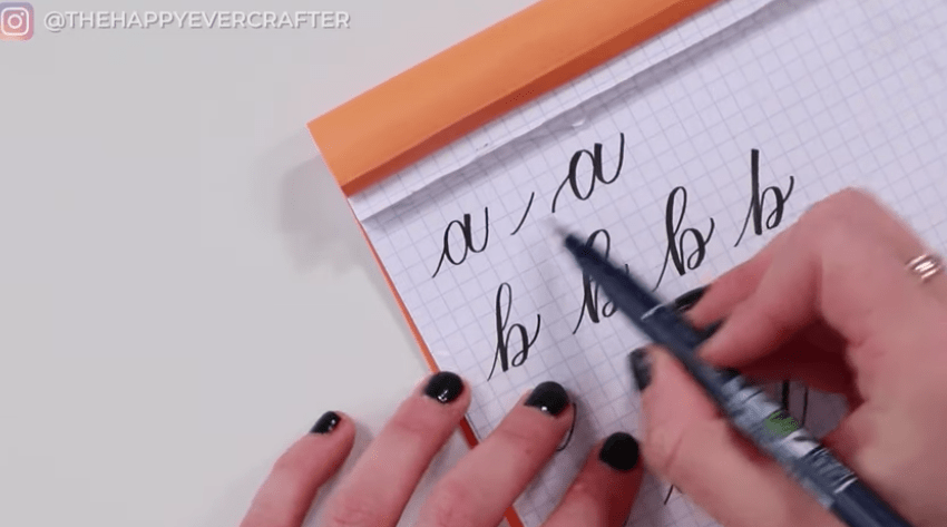
After you write out your basic calligraphy alphabet along the left-hand side of the page (this will be the basic one we’re going to compare to as we go – and if you haven’t learned basic calligraphy, STOP RIGHT NOW and go watch this video), identify your loops!
Trick #2: Remove your loops (descenders and ascenders)
Trick #3: (My fav) Change your entrance/exit strokes
Keep in mind, with all of these changes, you still have an upstroke, an oval and an under turn. We’re just adding some flair!

And that’s a wrap!
Test these out and have fun with it! Remember, there’s no “right and wrong” – modern calligraphy like this allows you to put your own spin on it, whatever that might be. Check out this video all about bounce lettering, and don’t forget to grab my bouncing and stylizing workbook!


Comments