These 4 calligraphy mistakes are suuuuper easy to fix and are pretty common for calligraphy beginners.
Throughout this guide, I reference the basic calligraphy strokes, so if you aren’t familiar with the modern calligraphy basics, please watch this video first!
First Things First…
The links below may be affiliate links where appropriate. This means that your purchase through these links may result in a few cents in payment to me, to support creating further resources like this one! That being said, I will never suggest supplies that I do not personally use and fully recommend.
Tools
Speedball Elegant Writer(this is the tool you DON’T WANT TO USE!)- Tombow Fudenosuke Brush Pen
- Tombow Dual Brush Pen
Now let’s get started!
Prefer watching over reading? Feel free to skip right to the video and see these in real-time! ??
Calligraphy Mistake #1: Using the wrong calligraphy pen.
In modern calligraphy, you need to make sure you have a flexible tool. What I commonly see is people going into an art store and looking for the calligraphy section… where you end up finding chiseled pens.
These pens have flat, non-flexible tips where you’ll get the thin and thick lines by moving your hand in a different direction.
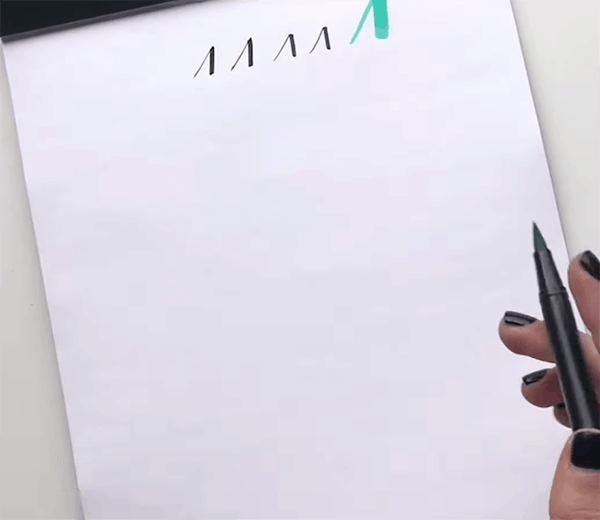
With a proper modern calligraphy brush pen (or flexible tip), like this Tombow Fudenosuke, all you do is change the pressure that you put on the pen.

Calligraphy Mistake #2: Holding your calligraphy pen wrong.
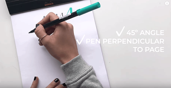
I see so many people holding their hands at the wrong angle to the page. They either have their hand too upright or too angled down. Or, it’s at the wrong angle, relative to the page.
You should actually have your hand at a 45° angle to the page and you want to make sure that your pen is perpendicular to the page. That way, when you add pressure to the pen, you’ll be able to get more of the belly of the brush.

Calligraphy Mistake #3: Writing too fast.
With calligraphy, it’s really, really important to write nice and slow. This allows you to get nice transitions from your thick lines to your thin lines.
One of the things I commonly see people do when writing a compound curve, for example, is a nice slow upstroke, a really fast downstroke, and then a nice slow upstroke again. It just gets messy!
I’ll also see the same thing on ovals – going nice and slow and then really fast, and then nice and slow again. Really, you should always be going nice and slow throughout, especially when you are first starting out.
Let’s say I was gonna write the word hello.

Too fast and messy! 
Nice and slow ??♀️
My transitions on the left are messy. My sizing is off, the spacing isn’t consistent, and I lifted my pen in a weird spot. However, if I were to do this nice and slow (on the right), because my speed doesn’t change on an upstream or downstream (speed stays the same the whole way through) you see a nice and smooth hello ?.
Note: I’m using just blank paper for this example, BUT you should always be using guidelines!
Calligraphy Mistake #4: Not using the basic strokes.
If you’ve never heard of the basic strokes, you need to go back to step zero, so make sure you watch this video, where I show you exactly how to do them all.
The main difference between using calligraphy basic strokes, or just adding pressures, is similar to cursive writing vs. calligraphy, and a lot of people don’t realize that those are different.
In modern calligraphy, everything is broken down into pieces. If you were to write the letter h, for example, it would look like this.

To break it down, an upstroke is one piece. Then you lift your hand off the page, you do your ascending loop as another piece, and then you lift your hand off the page. Then you finish with a compound curve and lift your hand off the page again.
The more consistent you can be with using those strokes, the more consistent your whole alphabet will look versus if you were to just do a cursive h and add your pressures, it would probably look something like the h on the right, which is totally different than the one on the left.
So if you’re not using the basic strokes, again go back to step zero make sure you’ve gone over those. I have lots of resources for that, and I think you’ll see a huge improvement in your calligraphy!
And that’s a wrap!
Ready for more calligraphy practice? Check out this video, where I show you how to do calligraphy with something as simple as a sharpie.

Comments