
This is the best way you can get better at calligraphy! If you’ve been practicing your calligraphy and watching “satisfying calligraphy videos” on YouTube, you might have missed a suuuuper crucial step!
I’m showing you my #1 tip for improving your brush calligraphy as a beginner– the basic strokes! These are the absolute BACKBONE to learning modern calligraphy.
First Things First…
The links below may be affiliate links where appropriate. This means that your purchase through these links may result in a few cents in payment to me, to support creating further resources like this one! That being said, I will never suggest supplies that I do not personally use and fully recommend.
Tools
Now let’s get started!
Prefer watching over reading? Feel free to skip right to the video and see these in real-time! ??
Most people understand that in calligraphy, you have light lines and hard lines. Adding pressure to regular cursive does not turn your writing calligraphy.
Let’s say you were to write a “g” in your cursive writing and then add pressure. It would probably look something like the g on the left. However, if you were to do this in true calligraphy, you get the g on the right.

This is where basic strokes come into play. You need to learn each of the calligraphy basic strokes and then when you start putting them together, they turn into letters. So let’s go through each of them.
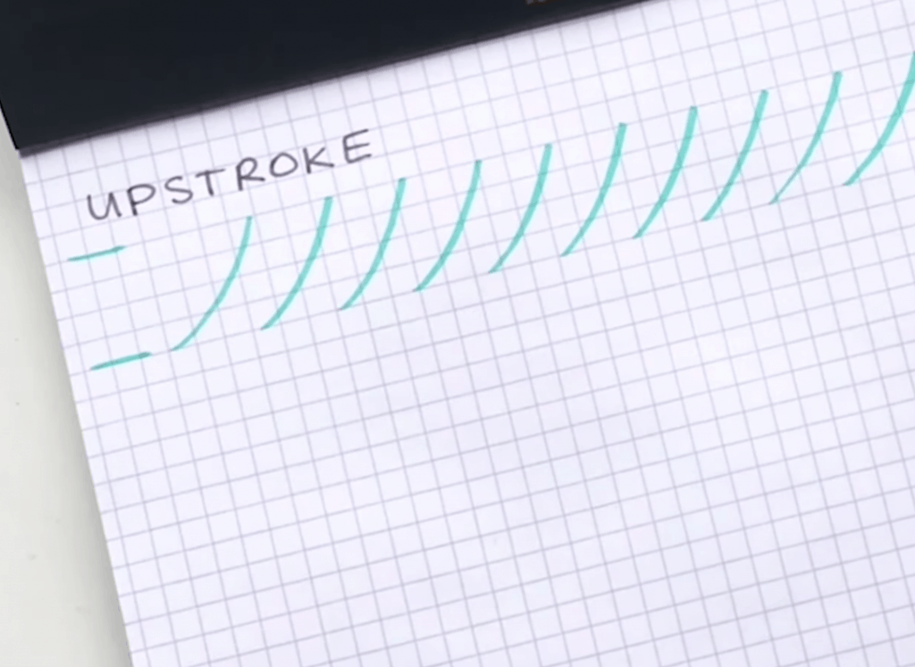
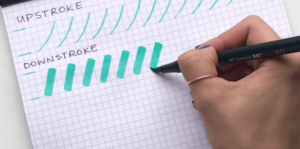
Basic Stroke #1: Upstroke
You’re going to start at the bottom and do a light upstroke all the way up to the top. You’re doing this really nice and slow and consistent, making a slight curve up to the top.
Basic Stroke #2: Downstroke
Here, we’re going to do the exact opposite. You have your waistline and your baseline, and now you’re going to start at the top with a hard downstroke.
A tip for you as you practice your basic strokes—rotate your pen every couple of strokes! Otherwise you might notice that your stroke starts to stray to one angle if you press on it too many times. (It’s also more likely to wear out your pen.) So, just rotate it! ?
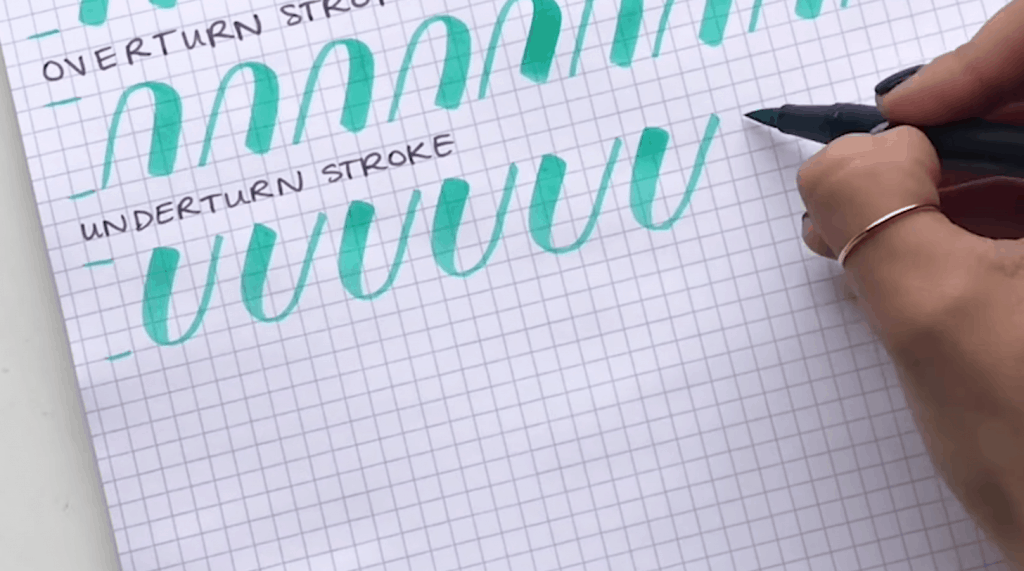
Basic Stroke #3: Overturn Stroke
For this one, you’re going to start at the bottom and your light upstroke be just as light as you did at the top, and then transition into your thick downstroke.

Basic Stroke #4: Underturn Stroke
This stroke is the complete opposite of the overturn. Here you’re going to start at the top with heavy downstrokes, and then transition into light upstrokes.
Basic Stroke #5: Compound Curve
A compound curve is sort of a combination of these the overturn and underturn strokes. Here, you’re going to start the bottom and go up light and then come down hard, and back up light again.
Now what you want to keep in mind with this one that these lines should all be parallel to each other.

Basic Stroke #6: Oval
An oval is probably the hardest stroke for most people. With this one, you’re actually going to start your off to the side a little bit, starting with an upstroke and transitioning into your downstroke. Then, coming back up light.
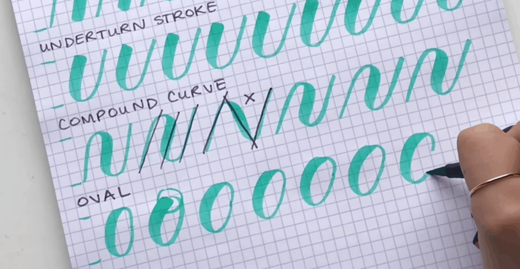
the reason you start off with at the side is that if you started at the top, then after your downstroke backup, the strokes wouldn’t meet up nicely back at the top with the same weight.
Basic Strokes #7 & 8: Ascending and Descending Loops
So these ones are going to be double the height that we’ve been doing. I’ve been using my grid paper at four squares but now I’m going to double it to eight squares.
The ascending loop starts in the middle, with a light upstroke and then comes back down into heavy downstroke. What you don’t want to do is have a little tail sticking out – you want to be ending that stem right where it began.
The descending loop is the opposite. You start with a downstroke – heavy down and then come back up light. Again, same thing you want to end right back at the stem you don’t want to give it a little tail.

So, why are these basics important?
Building your letters is as simple as sticking different basic strokes together!
Let’s take the word gain, for example, which breaks down really well how these basic strokes turn into words.
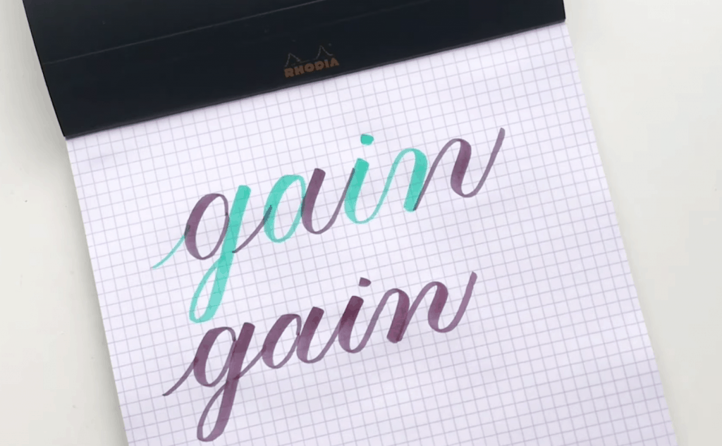
To start off, I would write the letter g, which would have an upstroke, descending loop, another upstroke, another underturn and then a compound curve.
You can really see how consistent that word looks when you break it down into the strokes, as opposed to just writing it in cursive with your added pressures.
The lower word shows how it would look all in the same color. It looks a little more like a word as opposed to the top version, but this is a really good demonstration of how those basic strokes turn into letters, and then into words.
If you don’t learn your basic strokes you’re going to really struggle with putting your alphabet together… and words will be even tougher!
And that’s a wrap!
Ready for more calligraphy practice? Check out my free course, Show Me Your Drills, where I go through all of these basic strokes!


Comments