A while back I did a tutorial about the basics of learning block lettering…. And wow, I did not know people wanted block lettering so badly! That video BLEWWWW UP on YouTube! I had no idea so many people wanted information on block lettering!
So I decided to do a little follow up…..
Once you’ve got a grip on basic block lettering, how can you make it a liiiiittle more stylized? How can you start to play with it to make it your own “style”?
I have 3 techniques for you!
First Things First…
The links below may be affiliate links where appropriate. This means that your purchase through these links may result in a few cents in payment to me, to support creating further resources like this one! That being said, I will never suggest supplies that I do not personally use and fully recommend.
Supplies Used
- Pen – I used a Sharpie, but you can literally use any pen for this.
- Paper – I used Rhodia, but you can use any paper for this.
- Ruler (optional)
- Pencil (optional)
Rather watch than read? No problem! You can watch me practice calligraphy with my left hand in real time in the video below.
Let’s Get Started!
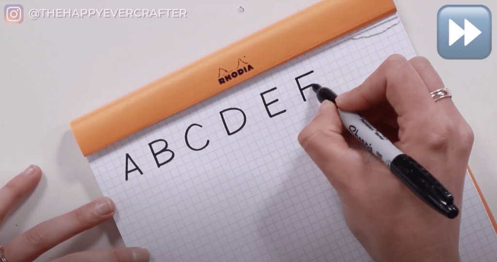
Start out with a really basic alphabet first (like the one you learned in my first post about block lettering). For this tutorial, I only showed you A through F, but feel free to go through the full alphabet.
I used a Sharpie for this, so I could make my letters thick and bold for you to see, but you can use any kind of pen you want.
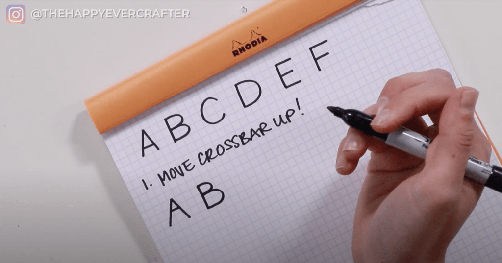
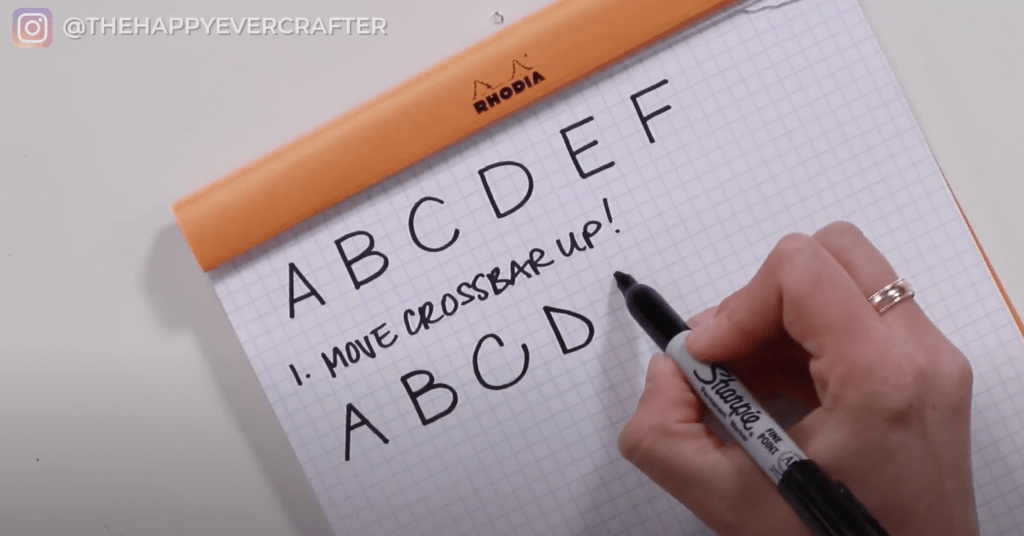
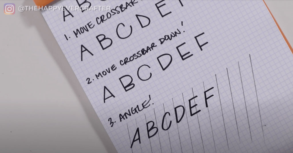
Tip 1: Move the crossbar up.
This will make your letters more bottom heavy.
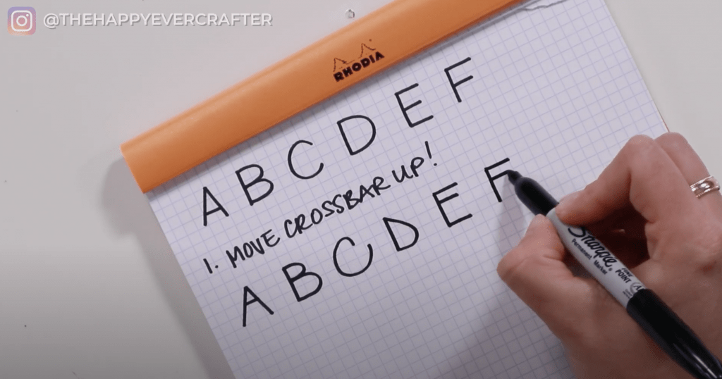
Draw the same frame of the A, but move the cross bar really high up. Same with the B. Make the top loop smaller than the bottom loop.
They look totally different than the basic letters!
There’s not a ton you can do to adjust C, but you can make it a bit bottom heavy. Bring the top in a bit more and extend the bottom out.
For D, come down quicker at top (make it more pointy) and then make the bottom a lot rounder.
I personally prefer to not change C and D from my basic alphabet. I am not a huge fan of adjustments for these letters. I wanted to show you all six letters for this lesson though, so I went ahead and made both C and D bottom heavy too.
For the E, move the crossbar up really high to get that bottom heavy look. Same with the F.
This technique is pretty simple. Feel free to play around with it a bit.
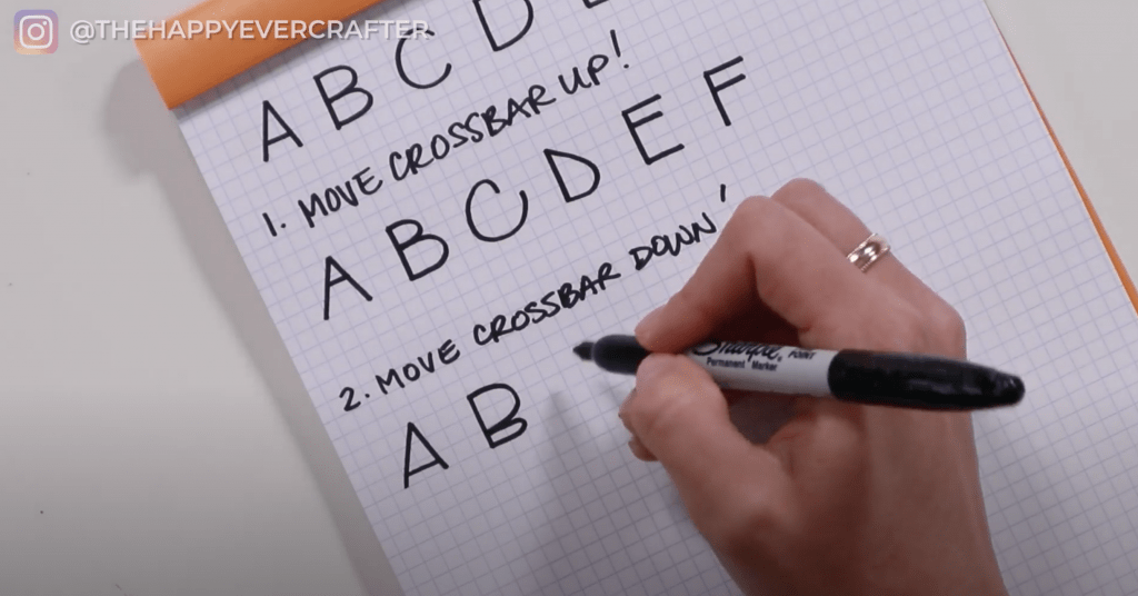
Tip 2: Move the crossbar down.
This will make your letters top heavy.
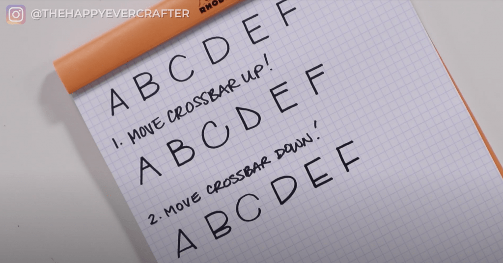
For your letter A, draw the frame of the A as normal. This time, you’re going to move the crossbar waaaaay down. For the B, make your top loop really big and your bottom loop small. My examples are very exaggerated. Your letters do not have to be this extreme. Feel free to pare it back as much as you want.
For the C, go really big at the big at the top and little at the bottom. For D, go really big at the top and come in sharper at the bottom. Basically the opposite of want you did in the bottom heavy technique.
For E and F, you’ll just move the cross bar toward the bottom like you did with A. Easy!
My letters are pretty messy, but hopefully you can get an idea of what I’m getting at.
Tip 3: Angle your letters
This tends to stress some people out, but don’t let it!
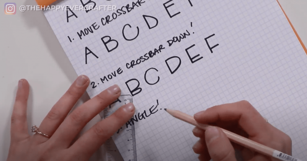
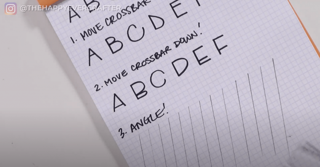
If you have angled guide sheets, those will be perfect for this. The paper I used for this lesson didn’t have angled guidelines, so I just added some really quick with a ruler and pencil. They’re rough guidelines but will serve their purpose.
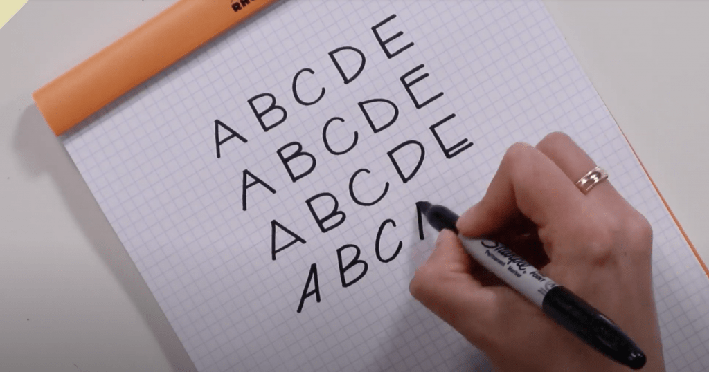
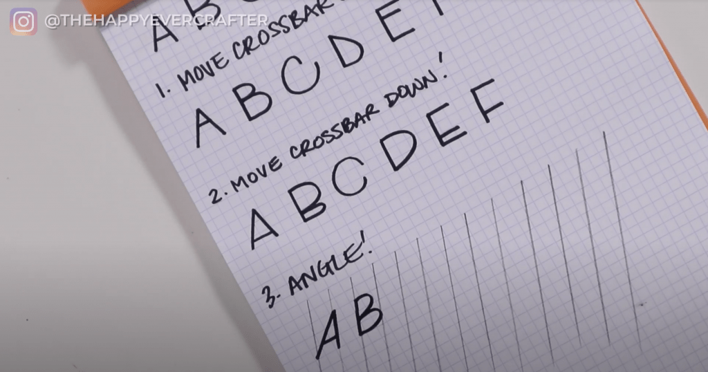
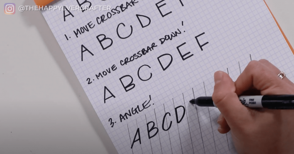
For this technique, you’re going to angle your letters. A is tricky because you’re only angling one side – the right side. Draw that side first along one of your angled lines. Then add your left side and your crossbar. Always keep your horizontal lines horizontal – don’t angle those.
For B, the stem will follow that angled line. Then add your loops.
C can be kind of tricky. You want to angle it a bit (a bit more than its original angle) but not a ton.
D is similar to B. The stem will be angled along your line, and then you add your loop.
For E and F, you want to angle your stems but keep all of your horizontal lines straight.
And that’s a wrap!
These quick changes to your original block alphabet give you three completely new styles to work with. There’s a ton of flexibility here. You can pick and choose which letters to stylize – stylize A and B but leave C and D basic. You can incorporate two styles at the same time – angle your letters AND move the crossbars. You can mix and match – crossbars high on a B and low on the E in the same word. You truly have tons of options here, so just experiment with it.
I’ve been doing block lettering for years and actually prefer the most basic one. But I highly recommend trying out different styles and finding what works best for you.
If you’re still not sure about your basic block lettering alphabet, here’s a link to my original block lettering tutorial. I definitely recommend starting there before jumping into stylizing.
And finally, your dad joke…
What do you call a baby monkey?
A chimp off the old block.

Don’t hold back