

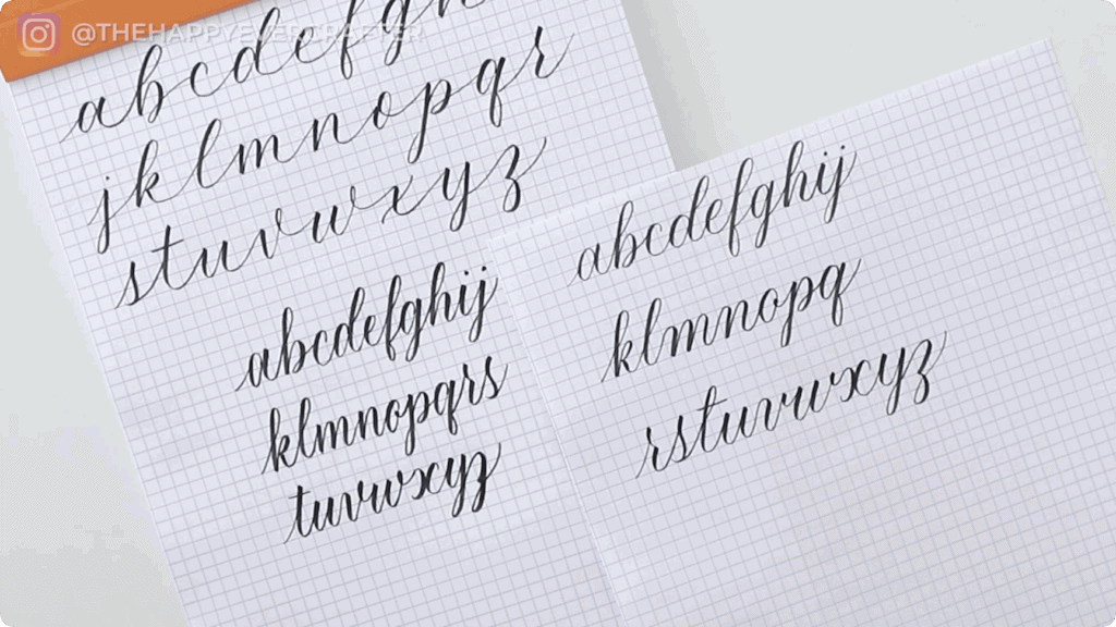
You’ve learned the basics – the fundamental strokes, the alphabet, how to piece letters together. Your work looks good, but it’s starting to feel a bit vanilla. Like everyone else’s basic alphabet. If that resonates, you’re in the right place.
Quick reality check: if you’ve skipped the basics and jumped straight to stylization, go to ShowMeYourDrills.com and take my free basics course first. I promise you’ll be happier with your results if you build the foundation properly.
Supplies Used
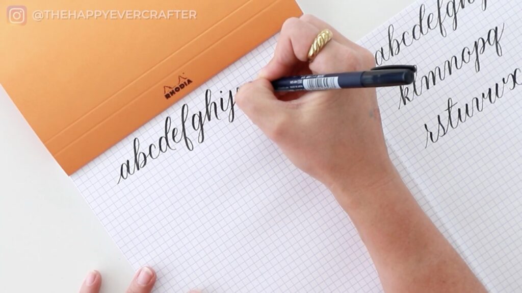
- Rhodia paper
- Tombow Fudenosuke brush pen (or your preferred brush pen)
- Your willingness to experiment and make “ugly” letters
If these materials are unfamiliar to you, that’s another sign you might want to start with the basics course – I cover all the essential supplies and recommendations there.
Rather watch than read? Check out the full video by clicking the video below!
Let’s Get Started!
For everyone else ready to level up, let’s talk about three places you can experiment with your letters to instantly change how your calligraphy looks.
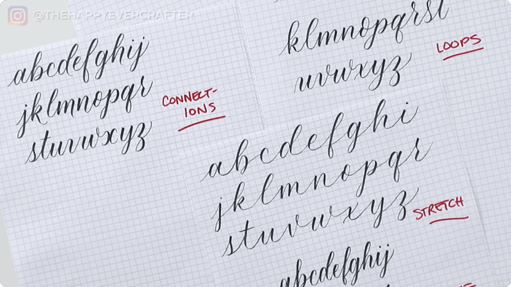
Tweak #1: Play With Your Loops
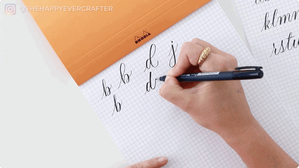
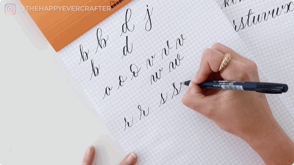
This is the simplest place to start, and it makes an immediate impact. I’m talking about the loops in your ascenders (like b, d, h, l) and descenders (like g, j, y), but also letters like O, V, W, R, and S.
Start with the obvious ones – ascenders and descenders. Where your basic B might have a standard-sized loop, try making it much bigger. Keep everything else the same, and you’ll instantly see how that one change transforms the letter. Same with D – play with the size of that loop.
Here’s where it gets fun. Experiment wildly at first. Make really exaggerated loops, then try really small ones. On your B, maybe make the ascender super narrow and condensed. On your D, try eliminating the loop entirely and using just a straight line. There are no rules here – big loops, tiny loops, or no loops at all.
The letter O is a common one for early experimentation. Instead of your standard oval, try adding a big flourish loop. It’s simple, but it makes your lettering look instantly more freeform and relaxed.
For letters like V and W that typically have a comma dot, try adding a loop at the top instead. You can make it substantial or keep it subtle – just experiment and see what feels right to you.
The same goes for R and S. Your basic R might be straightforward, but add a loop at the top and suddenly it’s got personality. Your S can have a loop at the beginning that changes its entire character.
When you’re first starting with this, fill an entire page with variations. Just play. Bigger loops, smaller loops, loops where there weren’t any before, no loops where there used to be some. Get a feel for what you like and what you absolutely don’t. Both are equally valuable pieces of information.
Tweak #2: Experiment With Spacing
This tweak is all about stretching your letters out or condensing them down. I’m going to be honest – I experimented pretty wildly with both extremes to show you the difference, and you should too.
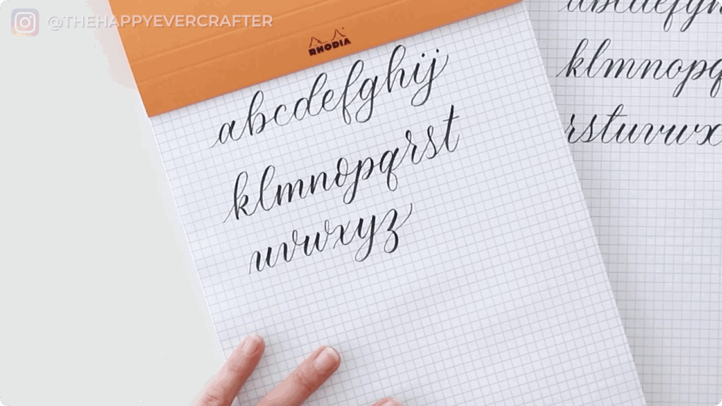
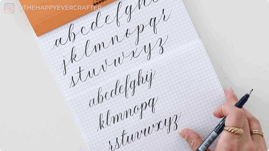
For stretched lettering, keep your basic strokes the same but extend the connections between letters. Make the spacing wider and more generous. Everything else stays consistent – the stroke quality, the sizing – but that spacing change completely alters the style.
Condensed lettering is slightly different because you can play with both the spacing and the actual shape of the letters themselves. The ovals in your letters might become narrower. Your spacing gets tighter. Everything tends to feel more vertical and upright. It often gives the lettering a bolder, more compact look.
The key is keeping your basic strokes intact throughout. You’re changing angles, spacing, and how squished or wide the letters are, but the fundamental structure remains the same. That’s what makes it still your alphabet, just styled differently.
Try both extremes on a full alphabet. Make one that’s wildly stretched and another that’s super condensed. These exaggerated versions help you understand the range of what’s possible, and then you can dial it back to something you genuinely love.
Tweak #3: Rethink Your Connections
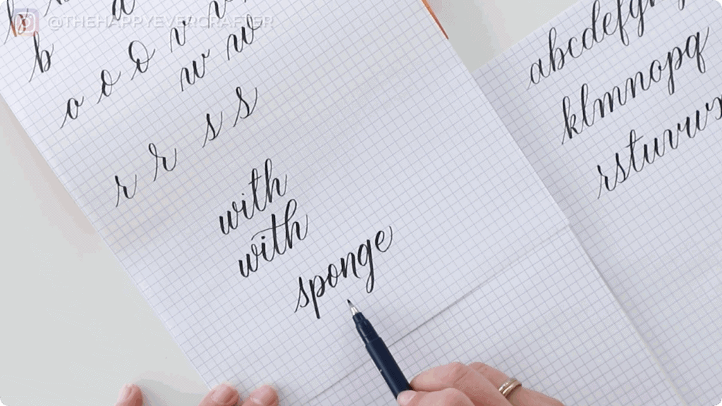
This one opens up so many possibilities. The connection I remember most vividly from my early stylisation days is the TH combo. It was one of the first tweaks I made, and I was genuinely surprised by how much of a difference such a small change could create.
Here’s what I mean. If you letter the word “with” in your standard style, it probably feels quite formal. But try this – do the bar of your T, bring it up to where you’d normally start your H, but instead of the typical connection, come off to the side and add a flourish that crosses your T and creates the downstroke of your H in one flowing motion. It’s an advanced move, technically a flourish, but it’s worth practising because it transforms how polished and personalised your work looks.
This works any time you have two ascenders next to each other, or two descenders. If you can figure out creative ways to connect them, those little moments make a world of difference.
The other connection experiment is to actually omit some connections altogether. Not every letter needs to connect to the next one. As long as you keep the spacing consistent – as if that connection were still there – it looks intentional and adds visual interest. I experimented with this across a full alphabet, disconnecting random letters here and there.
Full transparency – when I tried writing the word “sponge” with disconnected letters and no descender on the P, I immediately thought, “I would never write it that way. I genuinely hate how that looks.” But that’s the entire point. You play with it, you try something, and if you hate it, you’ve learned something valuable. You now know that’s not your style.
How to Actually Make This Your Style
Once you’ve experimented and exaggerated and discovered what you love (and what you absolutely don’t), it’s time to incorporate these tweaks permanently. The key is to do it gradually, one element at a time.
Next time you sit down to letter something, focus on remembering how you liked to do the O with that loop. Remind yourself to do it that way on every single O you write. Once you’ve built that O into your muscle memory and you’re happy with it, check it off mentally and move on to another letter.
This is not an all-or-nothing game. You don’t need to overhaul your entire style overnight. These small, intentional tweaks add up over time. You’ll notice things in your own work and in other people’s lettering. You’ll experiment, add some elements, remove others, and gradually build them into your repertoire. The more comfortable you get with them, the more they become simply part of how you write.
I guarantee that in a few months, you’ll look back and barely recognise your earlier work. Your style will have developed into something far more uniquely yours.
That’s a Wrap – Final Thoughts!
There’s actually one other huge tweak you can make to transform your calligraphy style, and that’s bounce lettering. I didn’t include it here because it genuinely deserves its own dedicated tutorial. If you’re curious about that, I have a full video on bounce lettering that goes deep into how it works and how to incorporate it.
For now, I hope these three tweaks give you a solid starting point. Experiment wildly, fail enthusiastically, and pay attention to what makes you excited about your own lettering. That’s where your style lives.
If you’re keen to dive deeper into stylization and bouncing, I have a full course and workbook that walks through all of this and more. It’s designed to help you cement these ideas and build them into genuine skills you’ll use forever. You can check it out here!
And finally, your dad joke…
I only get sick on weekdays.
I must have a weekend immune system.


Comments